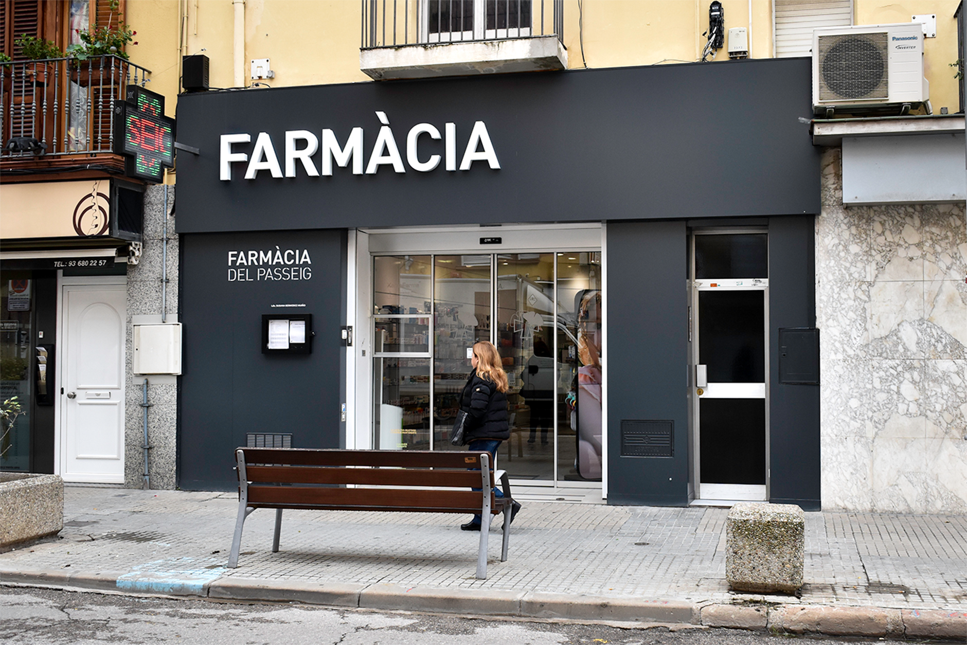
Identity project for a pharmacy
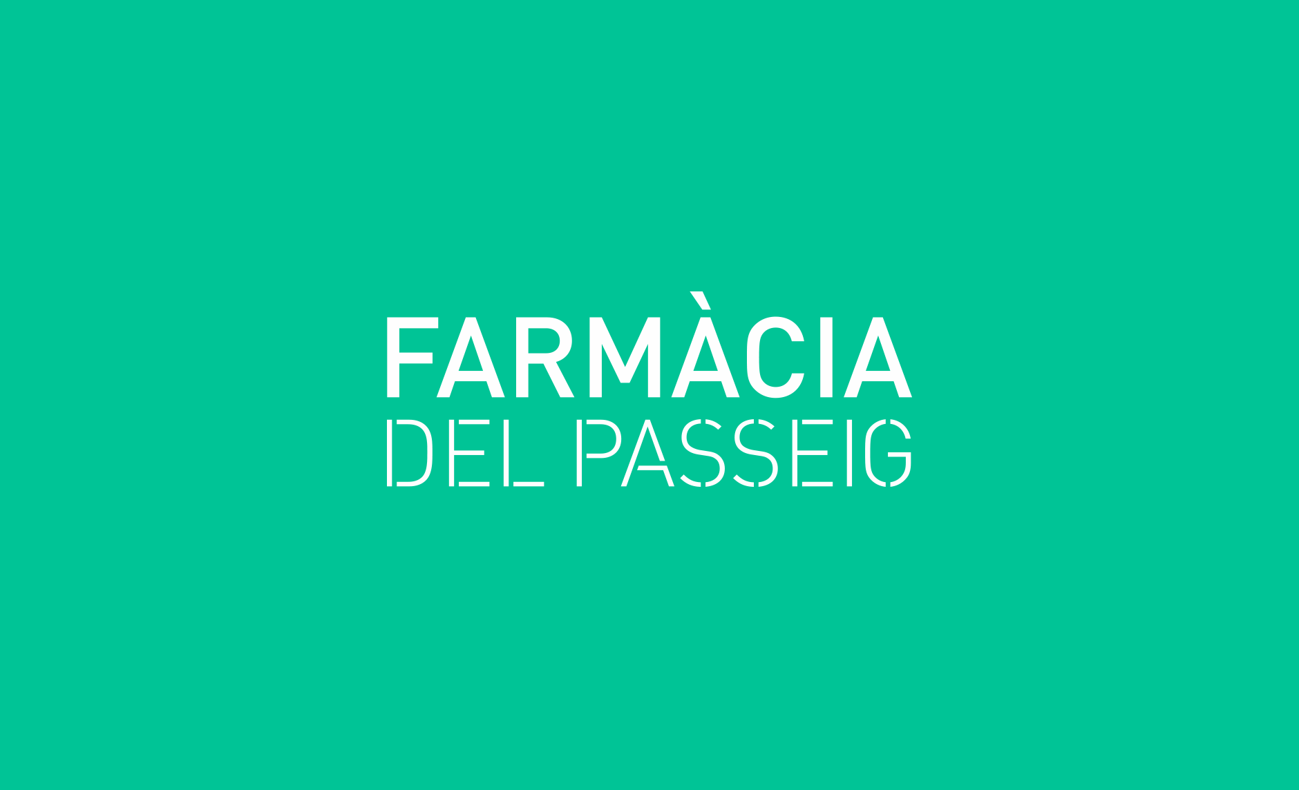
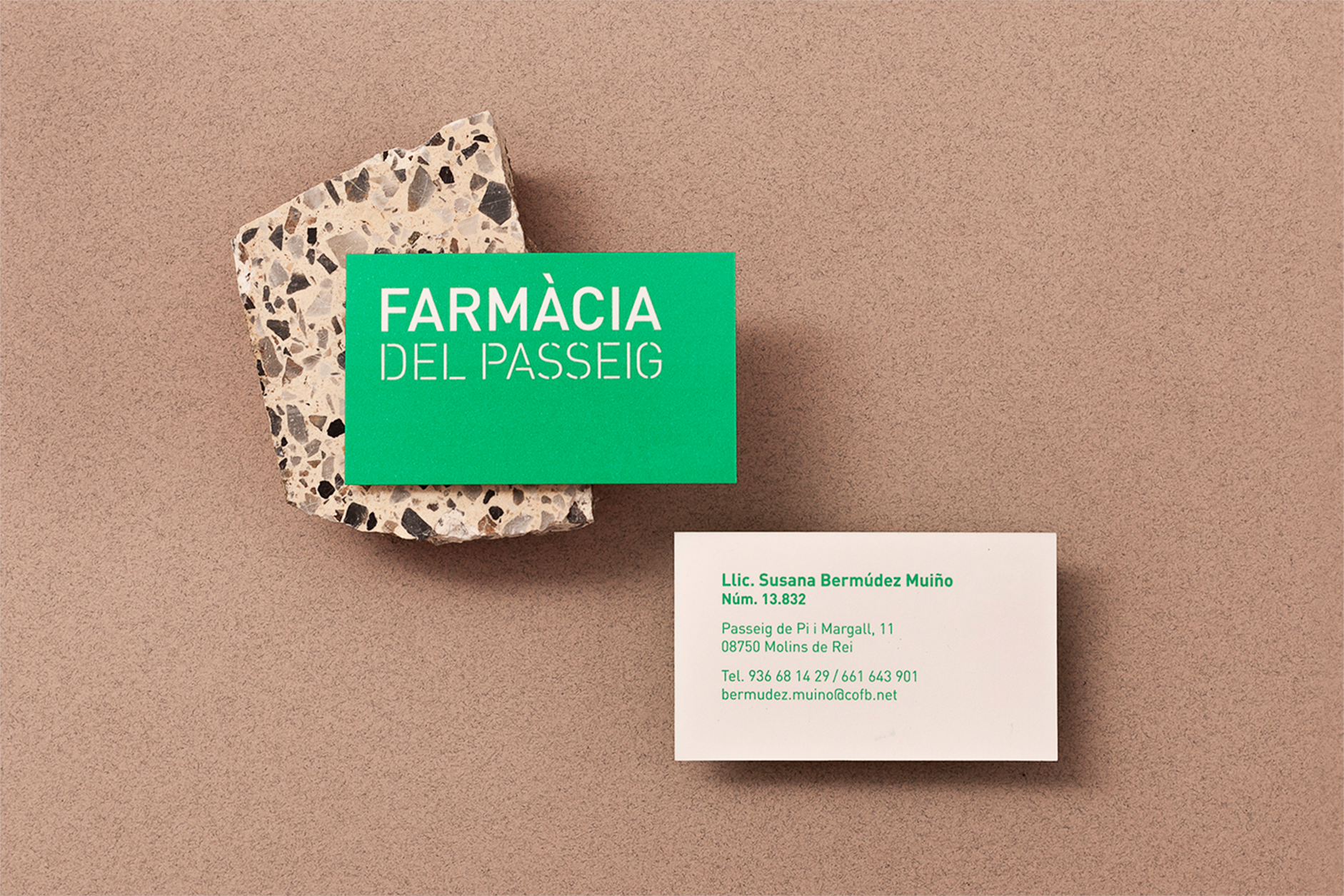
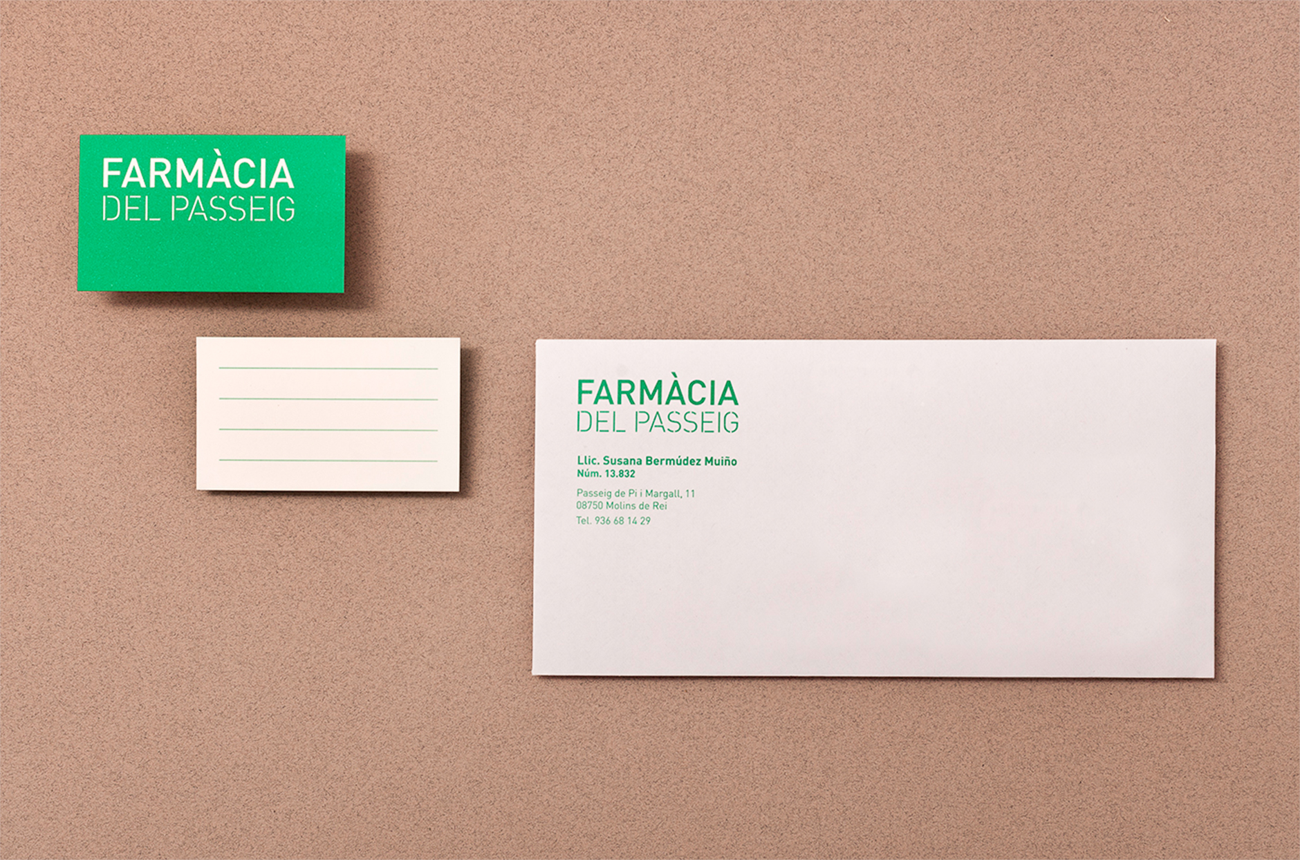
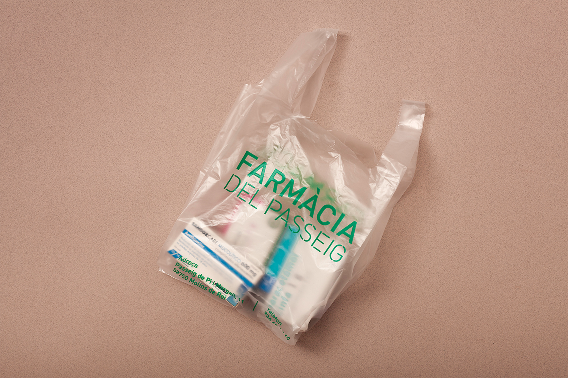
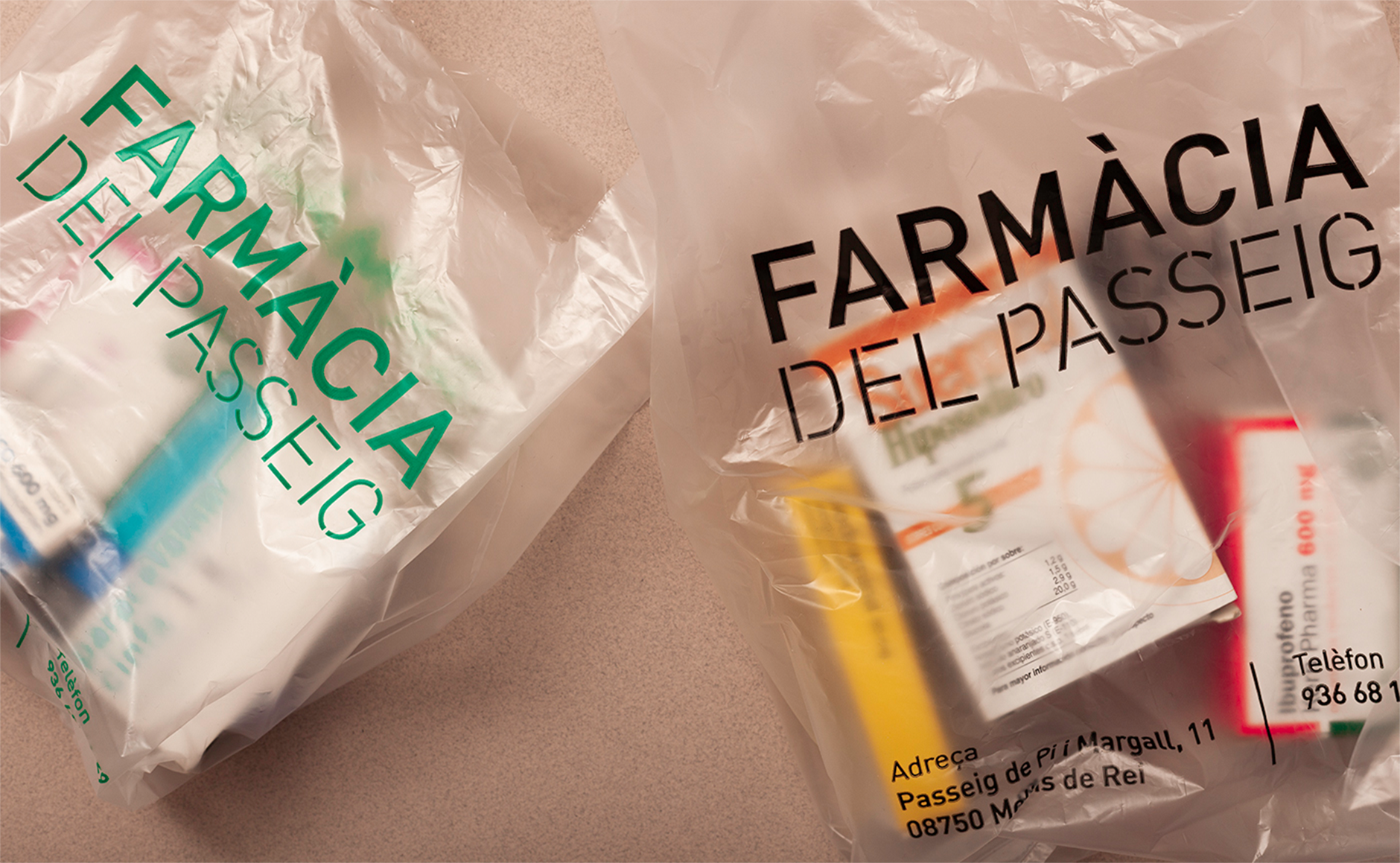
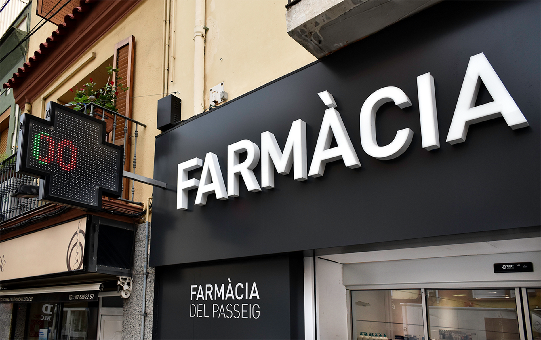
Corporate identity project to help position a pharmacy; “Farmàcia del Passeig” (Promenade Pharmacy) in Molins de Rei (Barcelona). The brand has been created with the idea of moving away from traditional icons associated with pharmacies. However, it also needs to be clearly identifiable. That’s why we have decided to keep the iconic colours of the pharmaceutical imaginary.
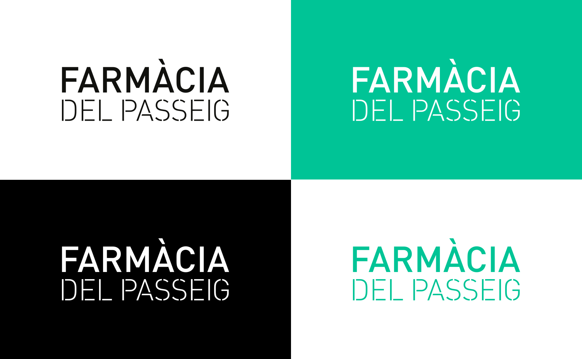
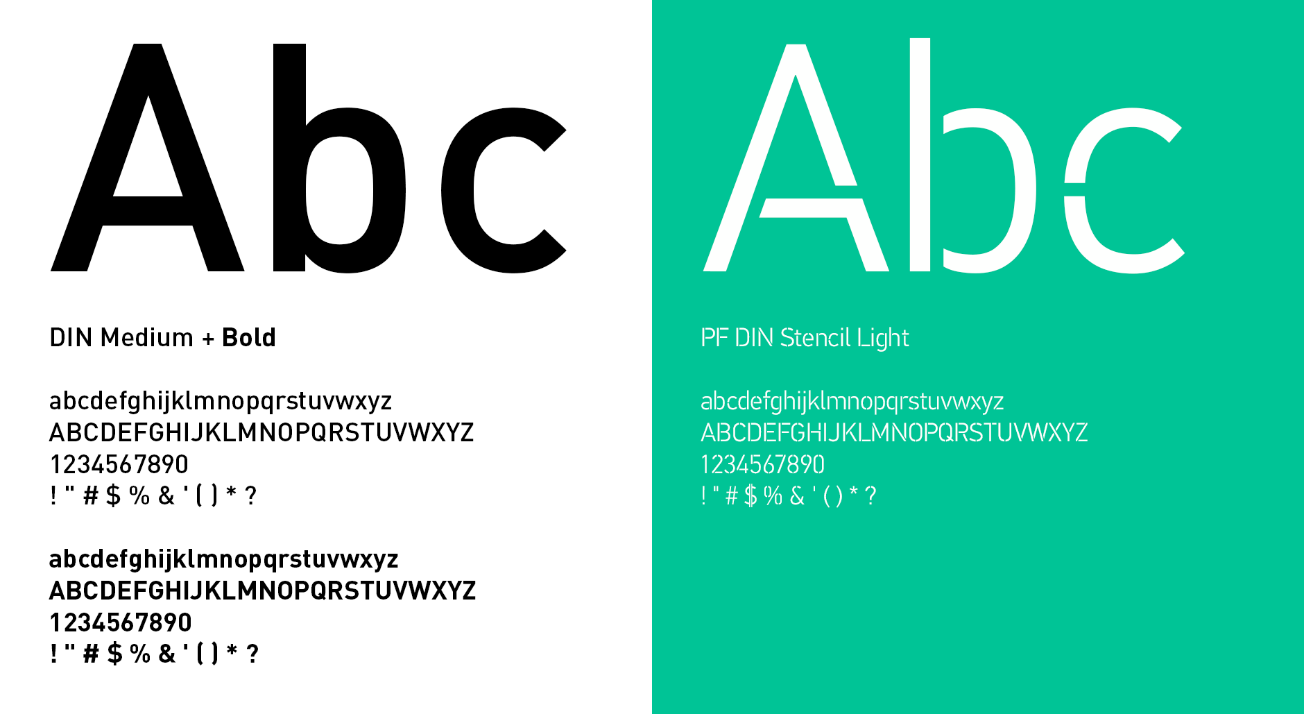
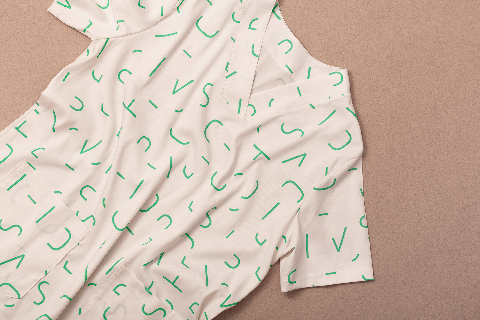
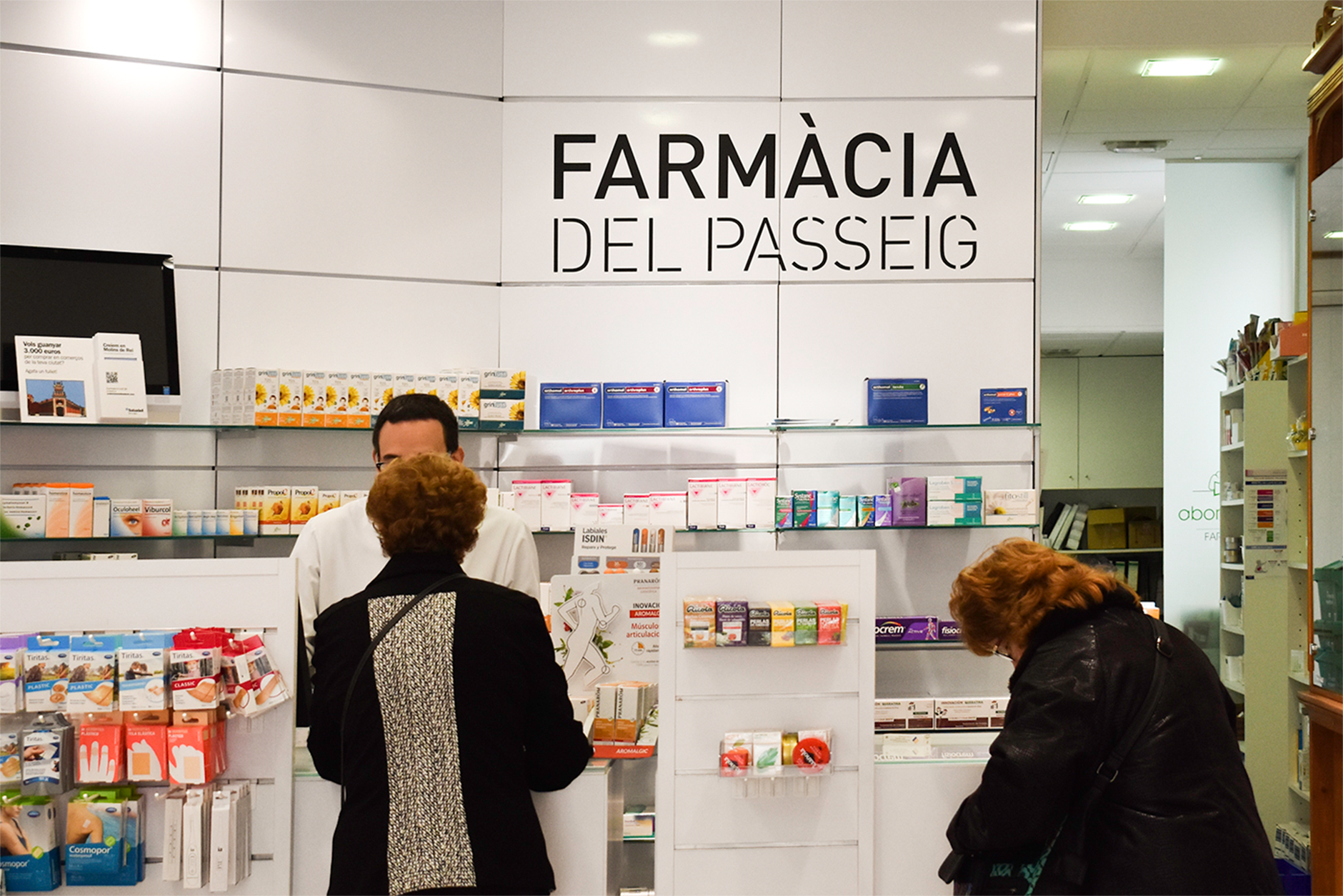
The logo has been made using two versions of the DIN typography, the sans-serif and the stencil. The reason why the stencil version was used is because it is visually similar to the minimal expression of a map seen from the air. It was essential to highlight the importance of the concept “Promenade”, referring to the location of the premises.
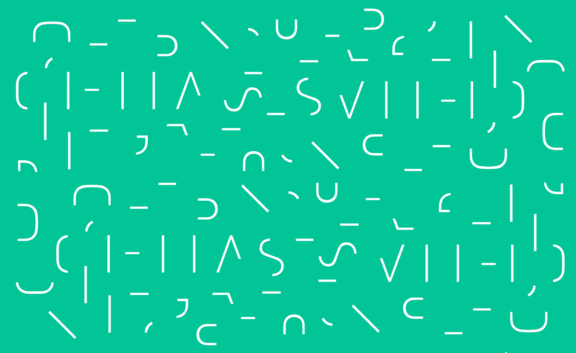
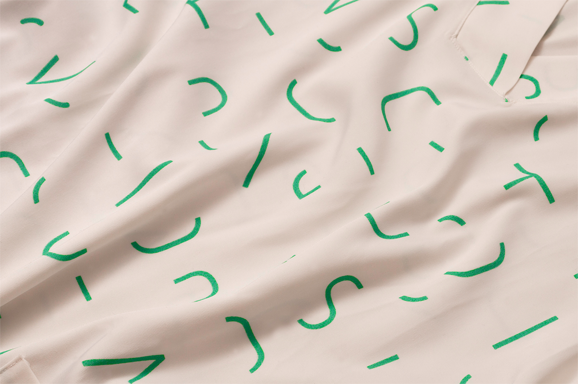
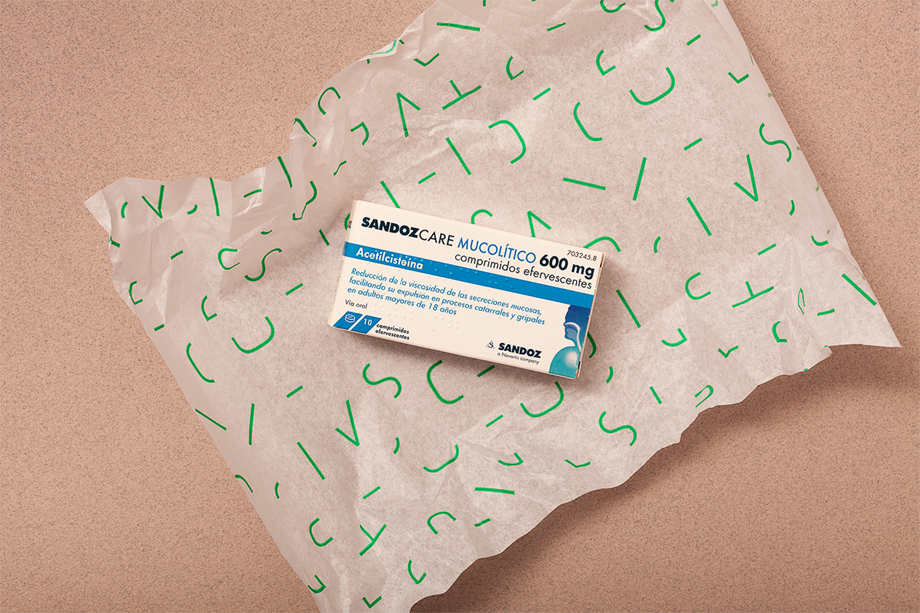
At the same time, these segments that make up stencil typography are defragmented to create a pattern, thus opening up a range of possibilities to develop a wide graphic system for the rest of applications (wrapping paper, scrolls, envelopes, etc.)
A creative solution that stays away from the traditional visual language of the pharmacies (cross, snake, cup), and creates a brand that differentiates itself from the competition.
Thanks for watching!
Art Direction: Marc Blanch, Alba Font
Animation: Marc Blanch
Dressmaking: Marta Prat
Photography: Félix Ruiz
Year: 2020